PopSimula
Real-time population simulation with dynamic fertility and demographics
PopSimula — Interactive Demographic Simulation for Exploring Population Futures
PopSimula is an interactive, browser-based population simulator designed for anyone interested in how demographic systems evolve through time. Whether you are a student of demography, a data-minded researcher, a policy analyst, or simply someone curious about how populations grow, shrink, age, and reshape themselves, PopSimula gives you a hands-on way to experiment with the forces shaping real countries.
Unlike traditional demographic tables or static projection reports, PopSimula allows you to manipulate fertility levels, age-specific childbearing behavior, mortality intensity, and migration while the simulation runs. You can watch a population pyramid transform year by year, observe total population trends, and even see your fertility decisions recorded in a historical chart. The tool is built to be intuitive and visually clear while still following the logic of well-established age-structured demographic models.
This guide explains how PopSimula works, how to use its interface, and how to interpret what you see.
1. What PopSimula Does
PopSimula simulates a country’s population in one-year time steps. At each step:
Everyone ages one year (except those who reach the maximum age, who die).
Survival probabilities determine who moves from age a to age a+1. The mortality slider lets you modify how harsh or gentle these probabilities are.
Fertility creates newborns, based on:
The total fertility rate (TFR) you set,
The mean age at childbearing (MAC),
A smooth age-specific fertility distribution shaped by your settings.
Births are split by sex using a standard sex ratio at birth.
Migration adds or removes population proportionally across all ages (if enabled).
Charts update automatically to reflect the new state of the population.
Through this system, you can experiment with:
Very low fertility futures
Recovery scenarios
Sudden fertility shocks
Policy-like interventions
Mortality improvements or crises
Migration booms or cutoffs
Long-run demographic transitions
Every parameter you adjust has a visible effect, helping you develop intuition for how demographic forces interact.
2. Starting the Simulation
Step 1: Load a Preset Country
PopSimula includes presets for several major countries such as Japan, Germany, India, the United States, and Iran. When you select a country and choose a base year, PopSimula fetches:
The real age distribution (from the U.S. Census International Database)
Historical fertility data (from the UN/OWID series)
Mean age at childbearing
Life expectancy
A reasonable estimate of infant mortality
These real-world values initialize the simulation, so what you see is not hypothetical — it is a continuation of the demographic story the country is already experiencing.
Step 2: Press “Load preset”
PopSimula fetches the data, sets up the age structure, initializes charts, and displays information about the indicators it loaded. You will see:
The population pyramid
The current year
The country’s total population
TFR, MAC, and life expectancy used
At this point, the simulation is ready to run.
3. Running, Pausing, and Stepping
Start
Press Start to begin advancing one simulated year at a time. Each simulated year takes a fraction of a second depending on the speed slider.
Pause
Stops the automatic stepping. You can still press Step +1 year to advance manually.
Step +1 year
Moves forward exactly one year. This is useful for careful analysis or educational demonstration.
Speed control
Adjusts the delay between yearly updates. Sliding left makes the sim faster; sliding right slows it down so you can follow changes more gradually.
4. Adjusting Fertility
Fertility is the most important force shaping long-term demographic change, and PopSimula gives you granular control.
TFR Slider (Total Fertility Rate)
This sets how many children on average each woman in the population would have under current behavior.
Move it freely while the simulation runs. PopSimula instantly applies your value to the next year’s birth calculations. This allows you to “steer the future” and see how different fertility scenarios play out in real time.
MAC Slider (Mean Age at Childbearing)
This shifts the peak of the fertility curve. A higher MAC means births occur at later ages. In real societies, MAC tends to rise as women delay childbearing.
Changing this alters:
The age distribution of new mothers
Timing of population momentum
The short-to-medium-term shape of the pyramid
Fertility Spread (σ)
Controls how concentrated or dispersed fertility is across ages. Smaller σ concentrates births around MAC; larger σ spreads them across more ages.
This can simulate:
Wide fertility patterns in lower-income countries
Narrow, late-age fertility patterns in high-income countries
Every birth you generate flows into the age-0 bar of the pyramid and carries forward as the simulation advances.
5. Mortality and Migration
Mortality factor
This slider increases or decreases death rates by scaling the underlying age-specific mortality schedule. A value of:
1.0 = baseline
<1.0 = lower mortality, longer lives
>1.0 = harsher mortality, shorter lives
Older ages are especially sensitive to this adjustment, so small changes can significantly alter the tail of the age structure.
Migration (per 1000 population)
Adds or removes population proportionally from every age group each year.
Positive values simulate net immigration; negative values simulate net emigration. Migration changes both the total population and the shape of the working-age segment.
Because many real countries use migration to counterbalance low fertility, this setting is particularly useful for policy exploration.
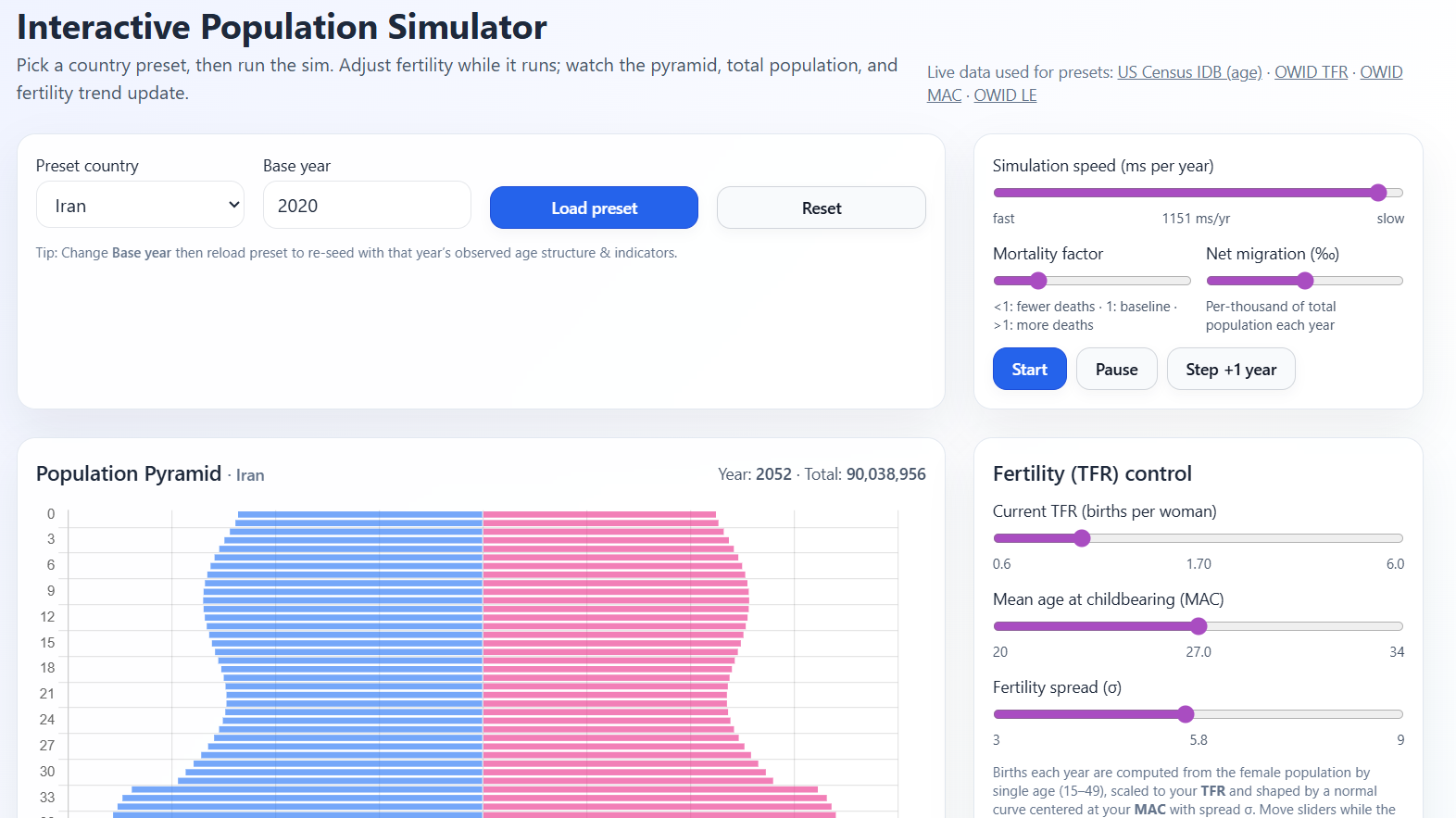
6. Understanding the Population Pyramid
The pyramid shows males on the left and females on the right. Bars extend horizontally, with older ages placed higher vertically. This layout allows you to see:
Age concentrations
Cohort sizes
Bulges or deficits
Aging speed
Gender differences
As the simulation proceeds:
The entire pyramid ages upward
Births add width to the base
Mortality thins the top
Migration modifies the center
Patterns you might observe:
Rapid aging
Occurs when fertility is low and cohorts entering old age are large.
Youth bulge
Typical when fertility is high or after a short-term baby boom.
Population contraction
Visible when births remain consistently below the number of deaths.
Population stabilization
A sweet spot where births, deaths, and migration hold the shape steady.
PopSimula makes these dynamics visually immediate.
7. Tracking Total Population and TFR Over Time
Two line charts complement the pyramid:
1. Total population
Shows how the entire population rises, falls, or stabilizes based on your choices.
2. TFR applied
Records each year’s TFR as you change it. This lets you experiment with different fertility paths — for example:
Decline to 1.3
Recovery to 1.9
Compensation period at 2.5
Stabilize at 1.8
You can compare how these paths influence long-run demographics, dependency ratios, and pyramid shape.
8. Tips for Using PopSimula Effectively
Here are some insights from demographic theory that can guide your experiments:
A. Replacement fertility isn’t always 2.1
Your simulation will often show that maintaining a stable population requires a TFR slightly above 2.1 — sometimes around 2.2. This happens because:
Your starting population may already be aged
Mortality isn’t perfectly idealized
Cohorts are uneven
Timing of births (MAC) matters
Migration is set to zero unless adjusted
This makes PopSimula a richer tool than theoretical equations.
B. Decline → Momentum → Shrink
If fertility drops below replacement, the population may keep growing for a while before turning downward. This is population momentum, which PopSimula displays well.
C. Delayed childbearing affects the next 20–40 years
Even if TFR stays the same, increasing MAC reshapes timing. Fewer births now → fewer young adults later.
D. Migration can stabilize an aging population — but not always fully
You can try to compensate low fertility with positive migration, but the long-term shape of the pyramid may still skew older.
E. Aging at the top accelerates as life expectancy rises
Your mortality adjustments can produce realistic “top-heavy” pyramids for high longevity countries.
9. What PopSimula Is Good For
PopSimula is ideal for:
Teaching demography: it visualizes concepts that are otherwise abstract.
Policy exploration: try pension reforms, fertility incentives, or immigration scenarios.
Long-run forecasting intuition: understand why countries with low fertility face rapid aging.
Comparative studies: load Japan vs. India and watch how paths diverge.
Research demos: show effects of ASFR shifts, mortality scaling, or delayed fertility.
Because it is fully browser-based and dynamically fetches real country data, it is portable, transparent, and accessible.
10. Closing Thoughts
PopSimula is built to make population dynamics understandable, exploratory, and visually engaging. By blending real-world demographic data with an intuitive, controllable simulation, it gives users a window into how birth rates, aging, and migration interact over decades. Whether you are running policy scenarios, studying demographic transition, or just curious about global population futures, PopSimula gives you the freedom to shape and observe demographic worlds in motion.
If you continue developing it, PopSimula could evolve into a teaching platform, a policy-analysis sandbox, or even a research demonstration tool. But in its current form, it already serves as a powerful, interactive way to explore the forces shaping the populations of our world.